Built from nothing.
Used by everyone.
How I went from a four-colour brand doc to a design system that runs across every Sandbox VR product.
Overview
When I joined Sandbox VR in July 2023, the design foundation was basically a mood board. Four brand colours, some glamour shots of a concept store. That's it.
Developers were hardcoding everything. Every button, every input — built from scratch, every time, slightly differently. Nothing was reusable. Nothing was consistent. And as the only designer, I had no source of truth to point at. Neither did anyone else.
So I built one.
The problem
The tricky bit: the system had to work across two very different environments. There's the digital product — booking flows, experience pages, account stuff. And then there's the physical in-store world — signage, hardware interfaces, in-venue UX. Both needed to feel like the same thing.
The mess I was working with:
- Devs rebuilding UI from scratch on every ticket
- Type, colour, and spacing all over the place
- No handoff process — decisions lived in people's heads
- Every new project or IP collab meant starting from zero
Start with the foundations
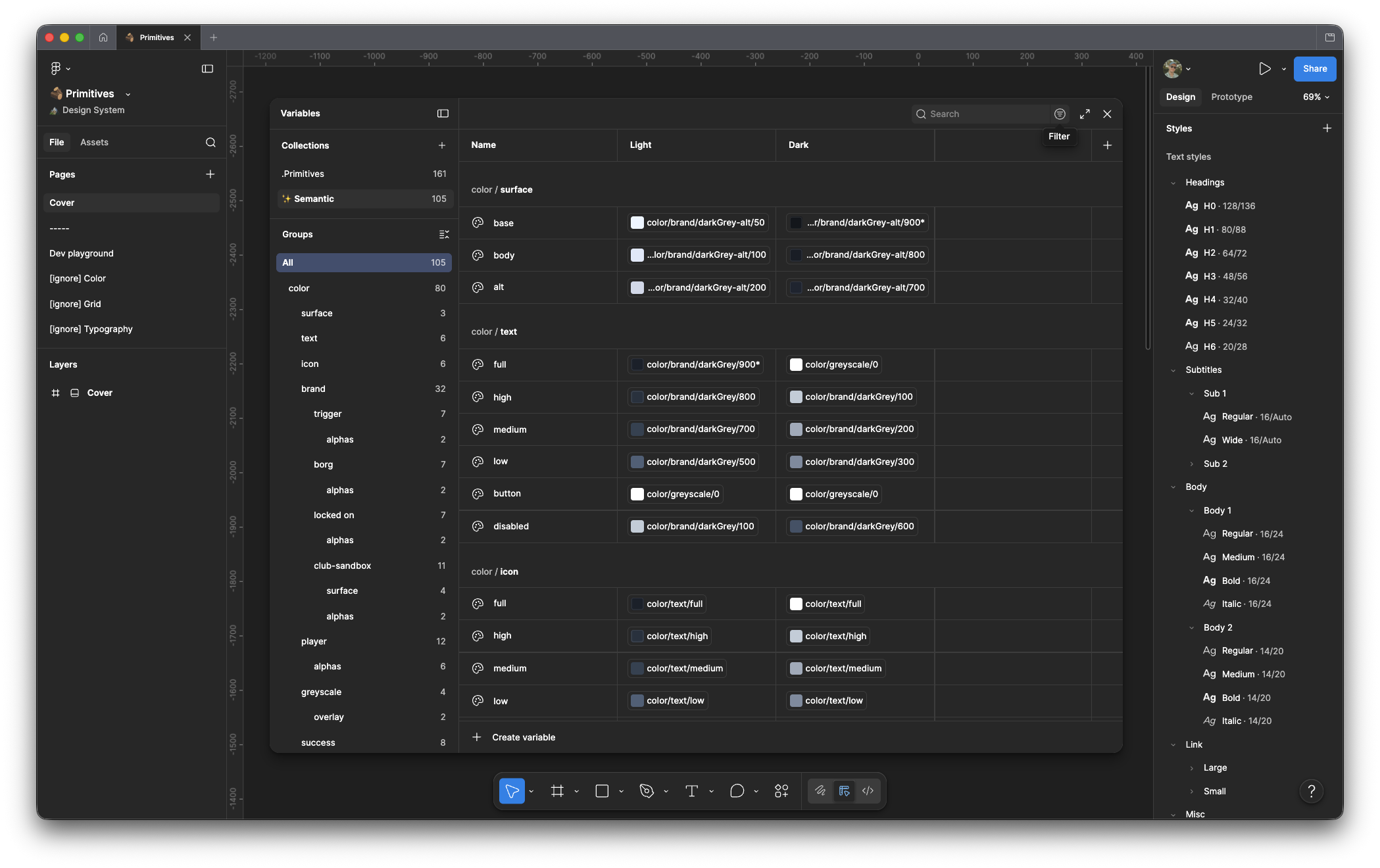
Colour tokens and typography scale across light and dark modes
I started with primitives — the raw values everything else inherits from. The system runs across two token levels.
At the primitive level, tokens use code-style naming that maps to actual values. brand.trigger.full is blue/700. brand.darkGrey.alt/900 is your darkest surface. These are the atoms.
The semantic level sits above that and makes things human-readable — color/surface/base, color/text/high, color/icon/full. Designers and devs talk in semantics. The primitives sit underneath doing the work quietly. It means if a value changes — new theme, dark mode update, rebrand — you change it once, at the primitive level, and it flows through everything.
Typography got a full overhaul too. When I joined, type was a mess — bold here, italic there, no logic. Replaced it with a proper scale, H0 down through body and utility styles.
Iconography
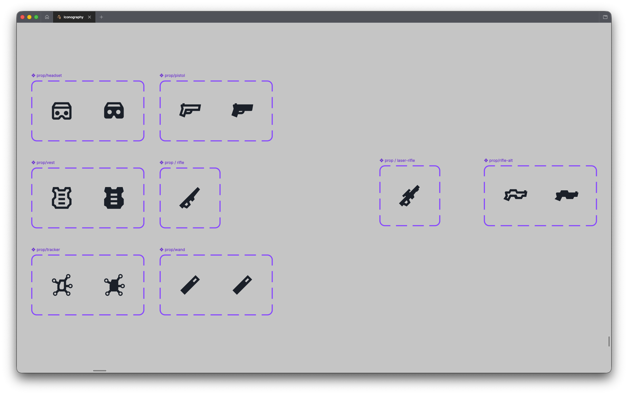
Custom prop iconography — headset, pistol, vest, rifle, tracker, wand
I built a set of custom icons for Sandbox VR's physical props — headsets, vests, trackers, wands — then used Google Material to backfill the utility stuff. Arrows, chevrons, add/remove, that kind of thing. Custom where it matters, sourced where it doesn't.
Components
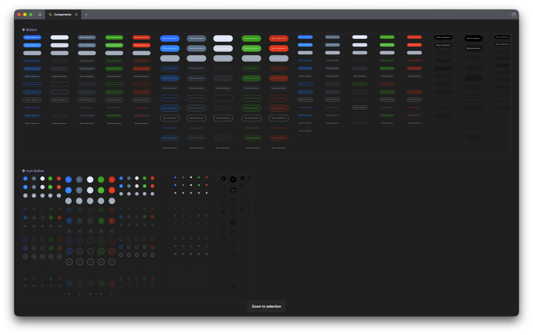
Full button component library — all states, sizes, and colour variants
Once the foundations were solid, I tackled the high-traffic stuff first. Buttons, text fields, nav, footers. All designed with accessibility in mind, built to work with how modern search actually surfaces content.
The goal was never a reference doc people dread opening. It was a lego kit — grab what you need, build, ship.
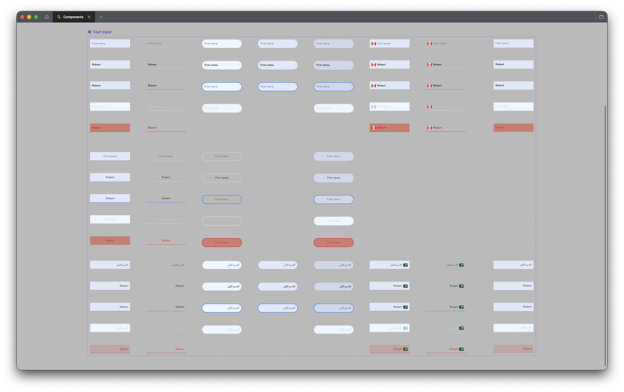
Text inputs across all states — including RTL Arabic variants for global markets
The system was built for global use from the start. Text inputs include full RTL Arabic variants. Not an afterthought — baked in from the beginning.
System in context
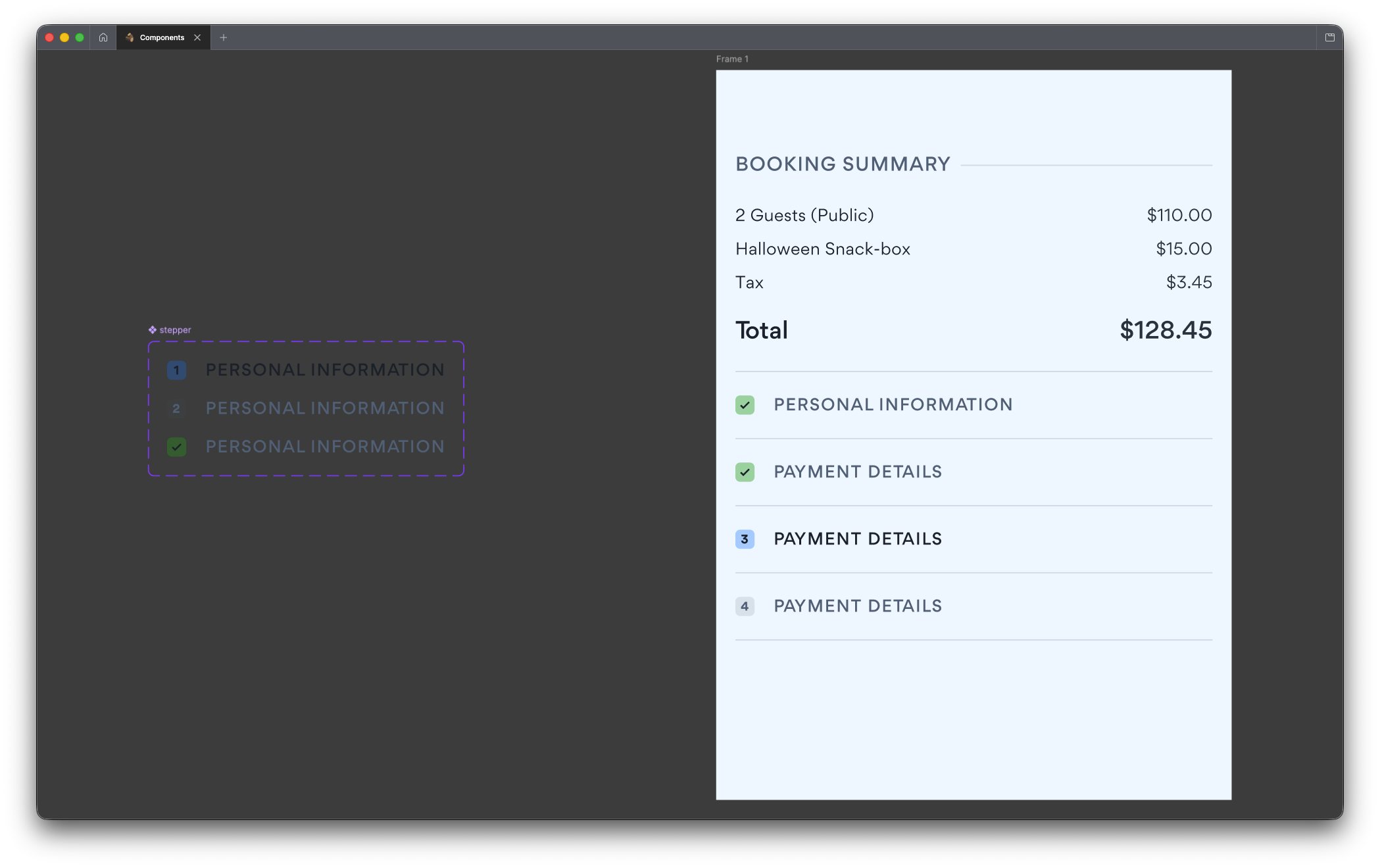
Stepper component alongside a real booking summary — the system working in the wild
This is the stepper component sitting next to a real booking summary — actual pricing, real product names, production layout. Not a demo. The system working in the wild.
How it's maintained
I didn't build it and call it done. That's how systems go stale.
Primitives are pretty much set-and-forget — the bedrock doesn't shift much. But the component and iconography files are kept live, with weekly dev syncs to make sure both sides stay in sync when something changes.
Design trends get considered, not chased. The system doesn't bend to every aesthetic shift — but it does respond when something genuinely changes how users expect things to work.
The proof
When Netflix House launched, an admin panel needed to go live fast. Devs built it with almost no design input — pulled straight from the system, implemented it, shipped it.
That's the whole point. Build the tool well enough that it works without you in the room.